Atlanta Airport App
Develop a visual/typographic system that would be implemented in a flight information display system for a mobile airport app. Visually and typographically communicate tabular hierarchy, data, imagery, and symbols.
Initial Ideation
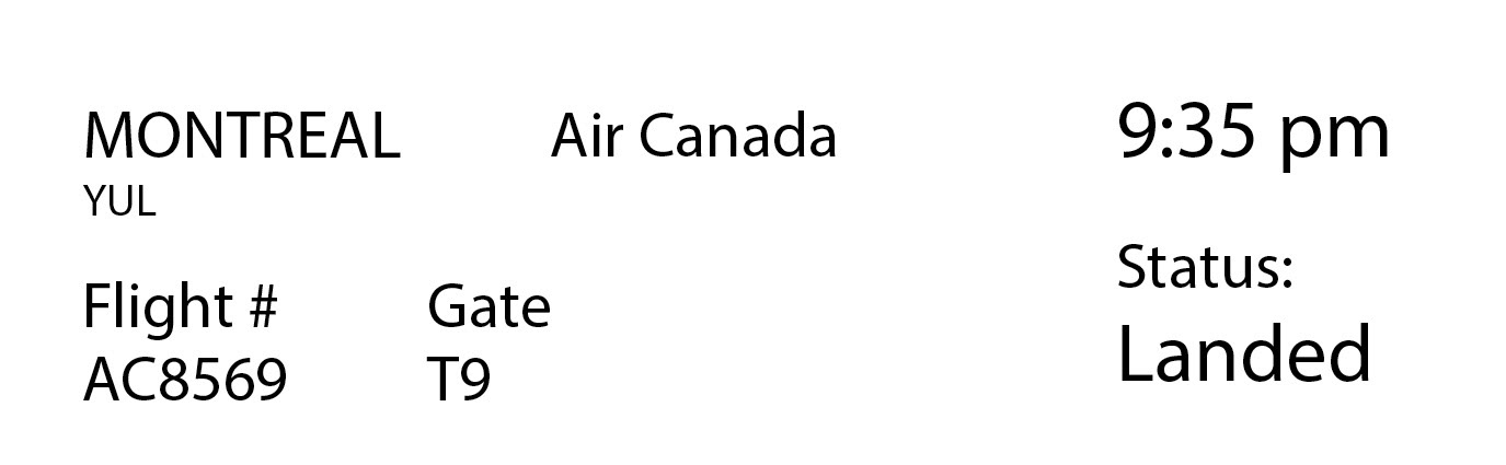
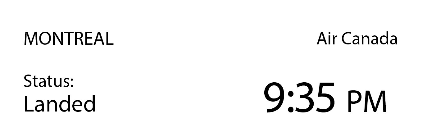
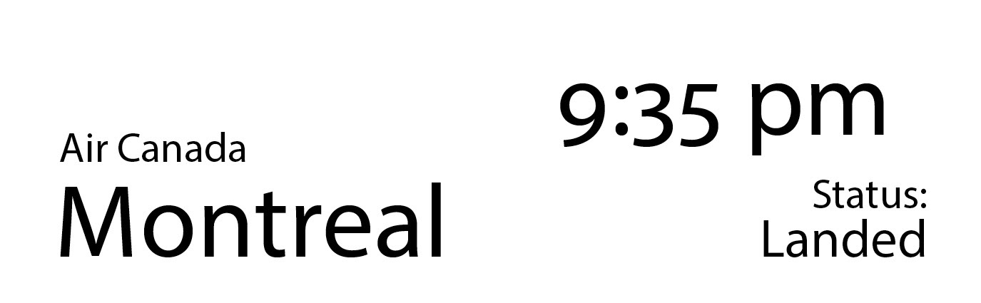
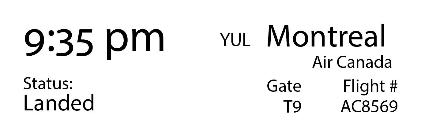
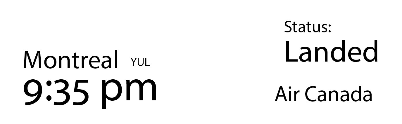
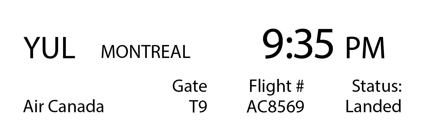
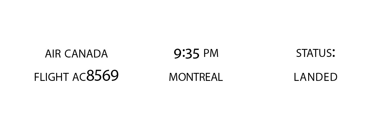
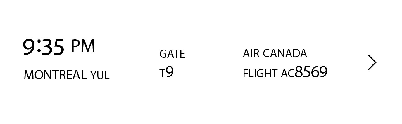
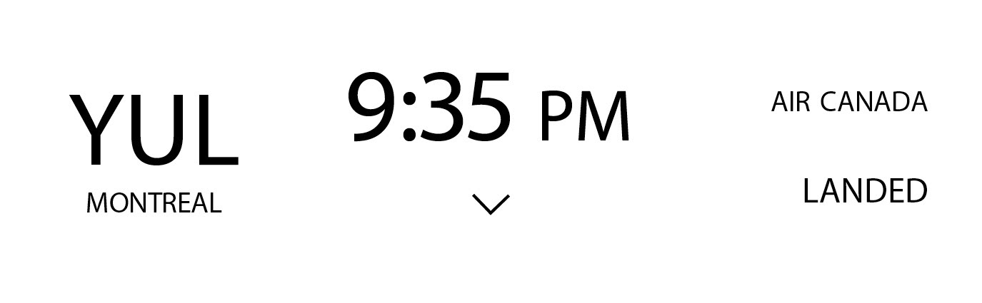
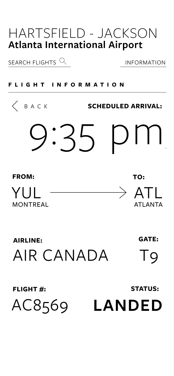
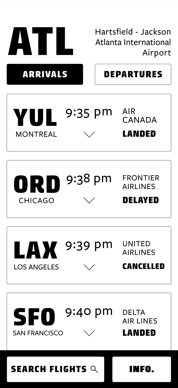
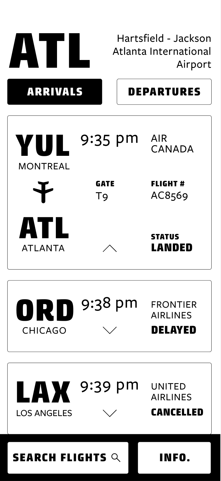
I started by experimenting with hierarchy and trying different layouts for each flight information module. Aligning information to a grid, I tested different items as the most prominent information to establish a clear hierarchy.
Interface Iteration
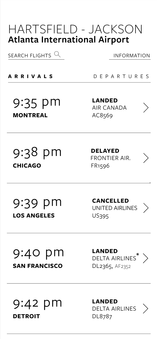
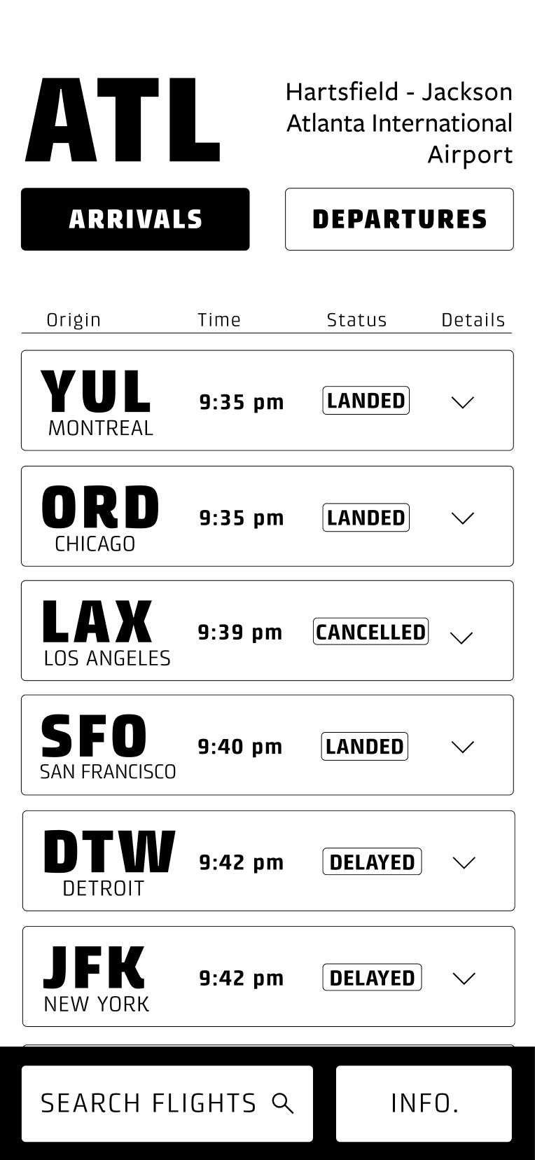
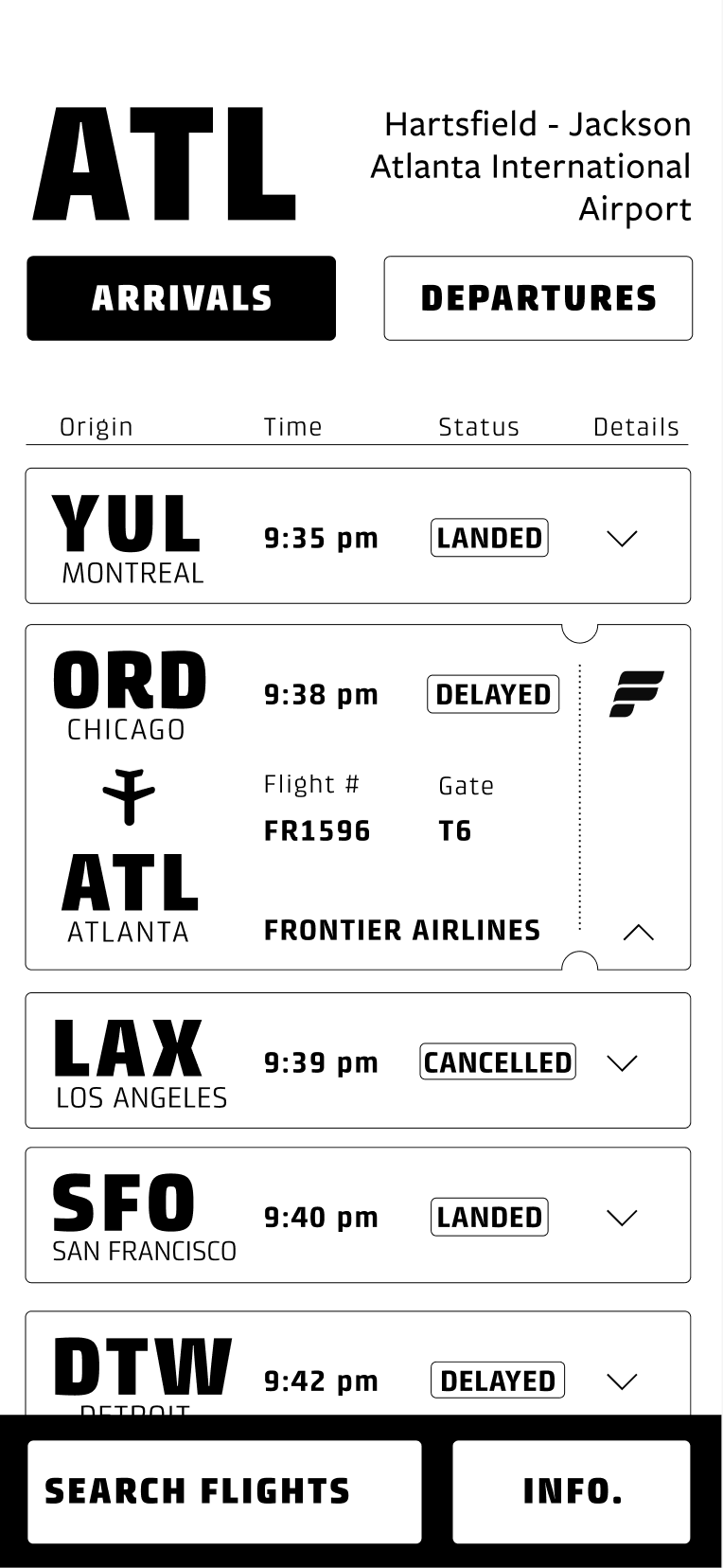
Refinement + Color Addition
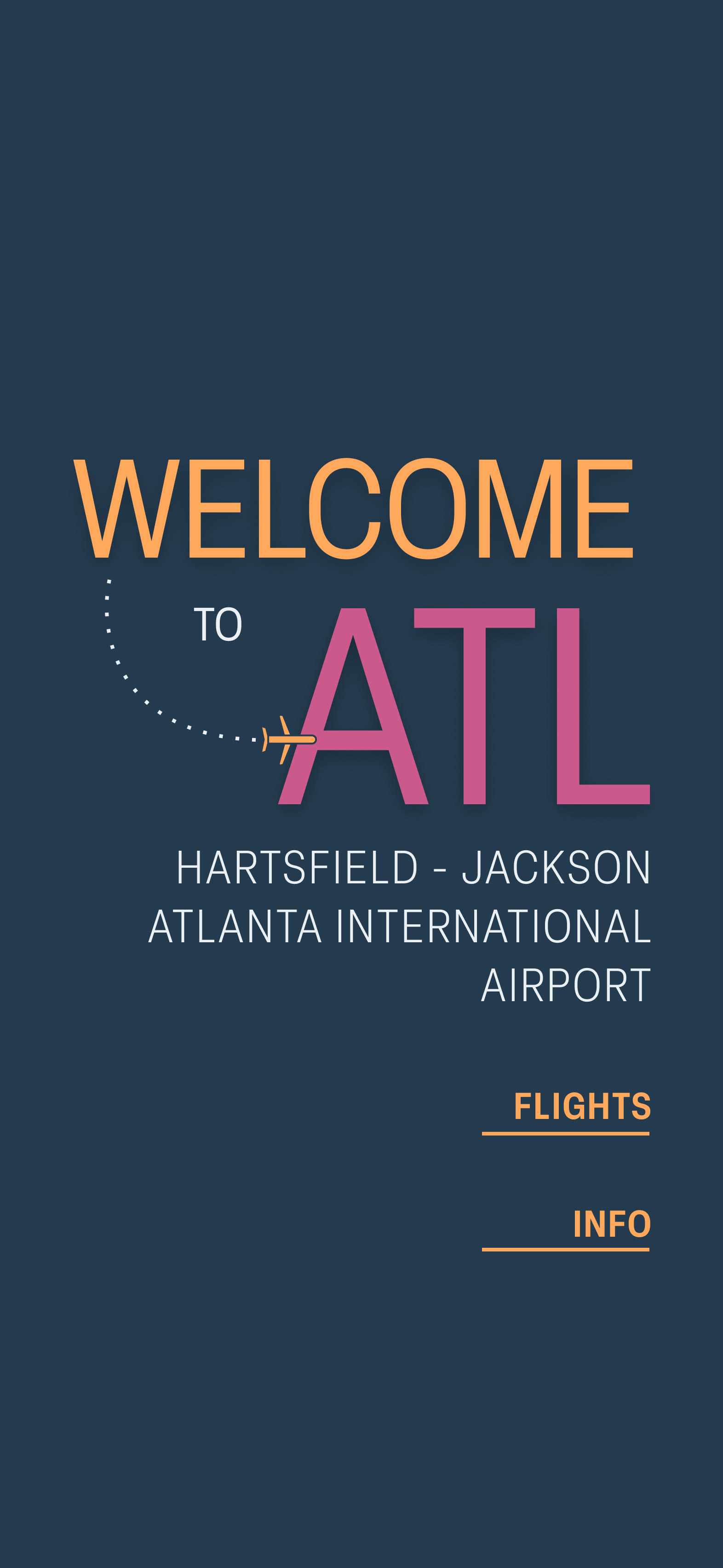
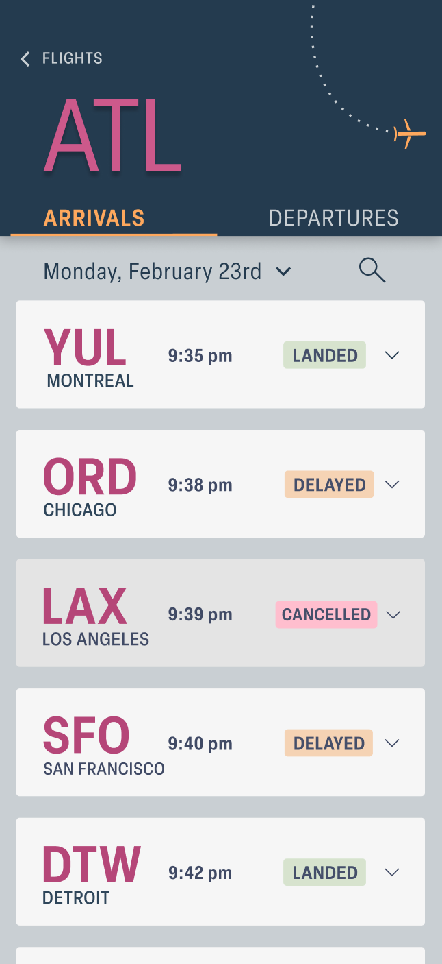
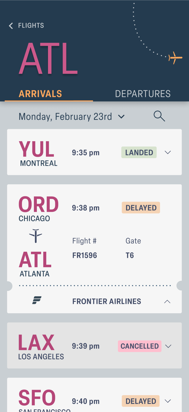
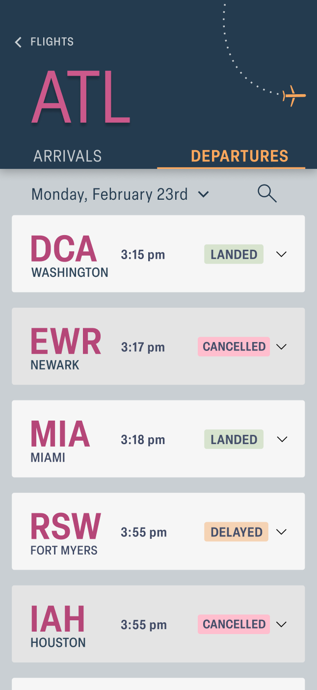
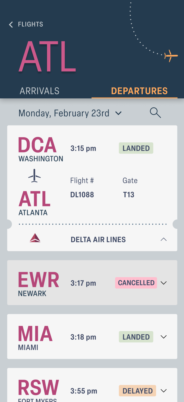
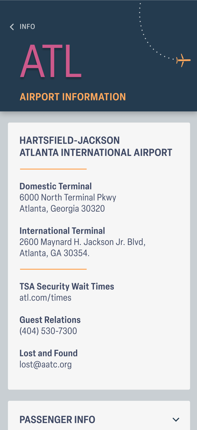
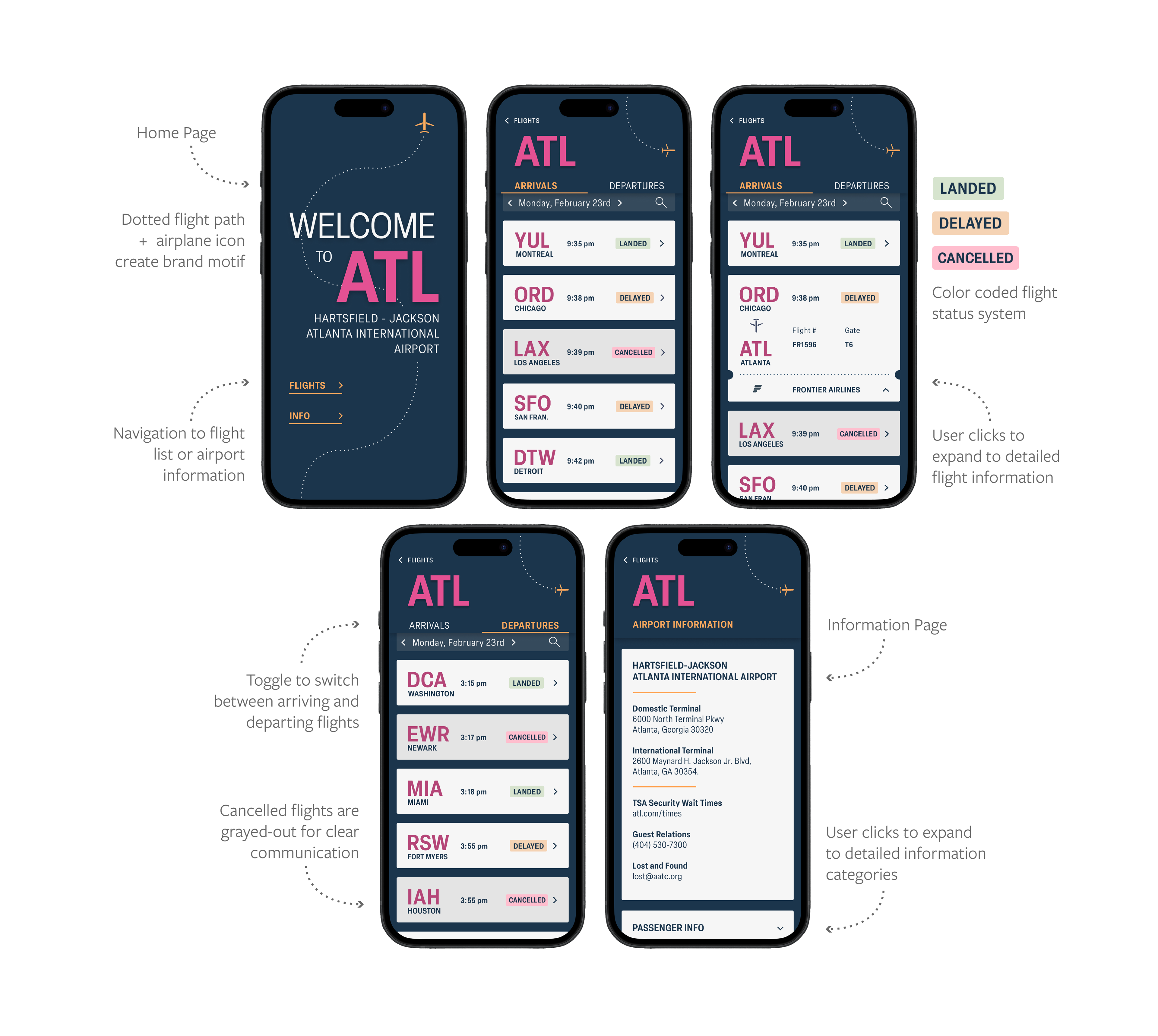
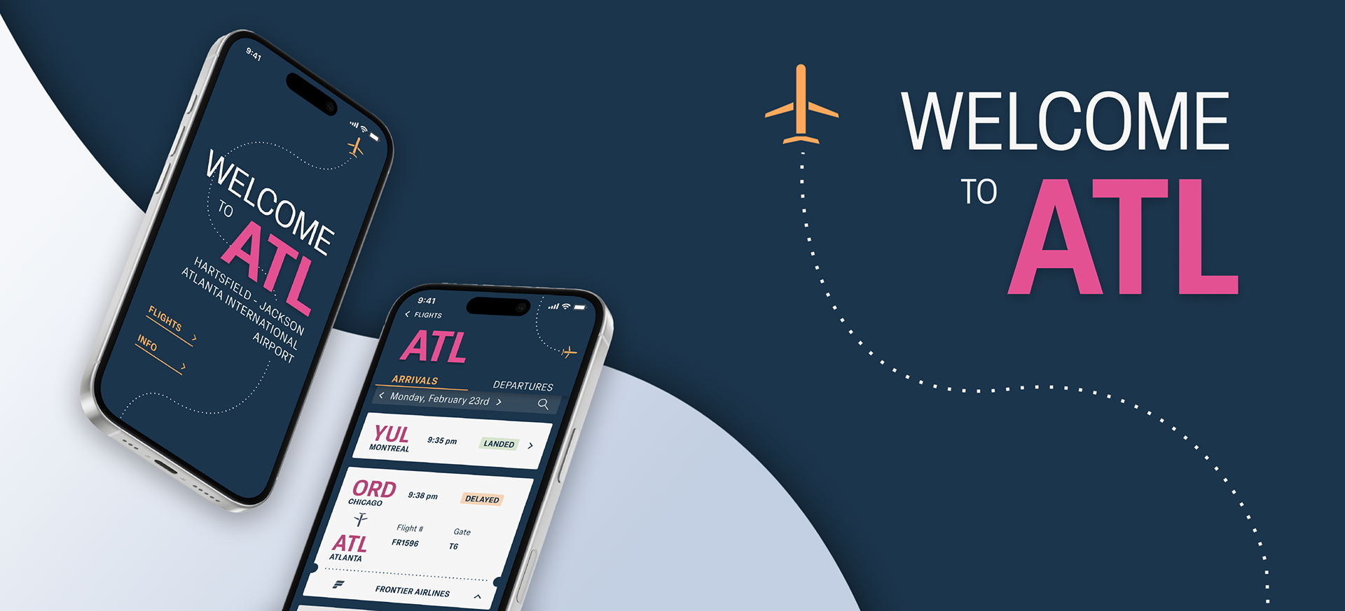
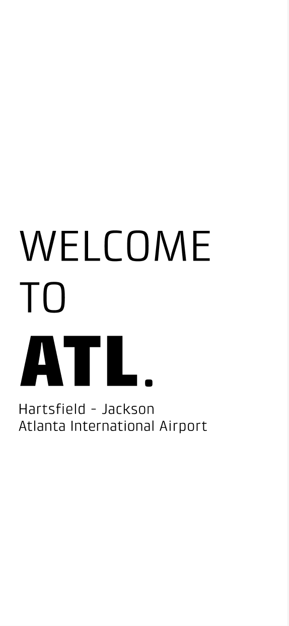
Once applying color to the design, I noticed some changes that needed to be made. In my final design, I tweaked some of the colors to create more contrast and make information more readable. The airplane and dotted line motif was incorporated more heavily on the landing screen to create a branding identity for the app design. I also increased the weight of the city titles and arrows to create a consistent body copy style that is bold and easy to read.
Final App Design